For four years we have made thousands of logos for customers from around the world. And very often we hear the same misconceptions about the design of logos. In this article we will discuss the five most common myths and will try to place the points over "I".
Myth first: the logo must show the scope of activity
Many entrepreneurs are confident that their logo must define what they do. Otherwise, as customers will understand that this is a coffee shop logo, if a mug is not drawn on it?Look around: how often do you see the car on the logo of the automaker? And the jacket on the manufacturer's logo of the jackets? Nevertheless, Mitsubishi is cars, Starbucks - coffee, and Apple is smartphones. Most often your logo will be seen upon request "eat", "buy a car" or "trim". Logo is a way to be recognizable, and not the answer to the question "What do you do?". You can show the sphere of activity and not using the logo. For example, make a banner or showcase with photos of dishes and drinks, or simply write the word "Coffee Shop" next to your logo.
Minus logos that show the scope of activity - the absence of ambitions. Among your colleagues, you will always be only one of many. But, if it does not matter, make an emphasis on what you do and catch traffic. If the goal is to develop a business to a level when any trademark will be associated with your product, then be original and do not be afraid experiments.
Myth Second: the value of the logo in the spent efforts
Imagine that you ordered a logo for a company that sews sportswear. Twenty thousand rubles are listed on the freelancer map. And now, two weeks later, he sends you a picture. On her here: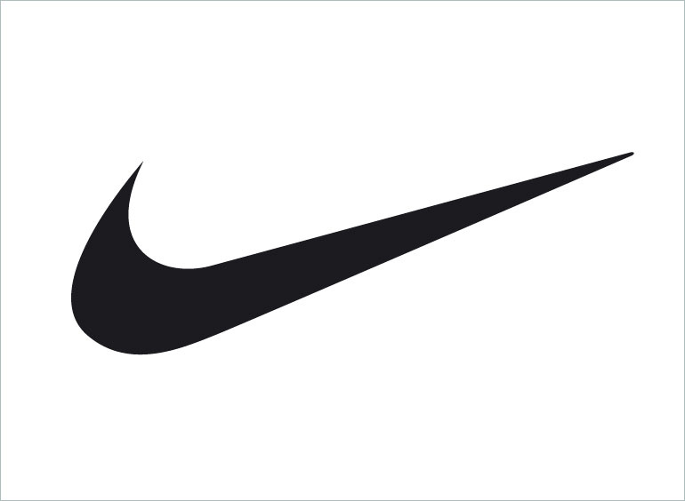
Of course, you ask the freelancer how many seconds have it left for it ... this "noise"? And then make a long time to redo the logo of a dozen times to the damned "designer", at least somehow worked the money spent.
Such situations occur constantly and irritated customers can be understood. The dissonance between real money and the logo, which is physically drawn in a couple of seconds - too large. The endless edits and alterations begin, and as a result, the first option is still the first option. The problem is that many people do not fully understand the design and measure its value in the efforts spent.
Sometimes good things are good, not because years have gone to their creation. If the logo is effective, it does not matter how difficult it is. "Noise" Nike from the example above is a sample of a good design. And the errors that the designer did not allow, there are much more important than the virtuoso work with graphics. Good design - invisible.
The logo without corporate identity is useless. If you know where the logo will be used, see the ideal image of the company and its audience, then you should turn to a professional designer and order not only the logo, but also the company's entire company style. And if you do not understand what it is about - to professional designer should turn to the time. When there is a style, the logo ceases to be a "checkmark", a whole concept is organized around it and therefore it brings an objective benefit.
Myth Three: In the logo there should be a hidden meaning
Solve rebuses - great! The brain loves to work and we are satisfied with a solved problem. Logos with riddles and hidden meaning are often found. To refer to the legend of the company, its corporate values \u200b\u200bare the highest pilot for the creator of the logo. On the other hand, logos, in which there is no hidden meaning, much more. The reason is the lack of practical benefit.
On average, a person has about a second to notice the logo, while it almost does not remember the details. In April, we conducted a small experiment, in which the logos of famous companies - Lacoste, Apple, Yota, Peugeot, Qiwi, MegaFon and others painted in memory. The experiment showed that people remember only the overall features of the famous logo, sometimes thoroughly even with form and color.
Despite this, again seeing the logo on the sign, the man immediately recognizes it and identifies with the company. In this sense of design. Does the hidden meaning affect this process laid down in the logo? I do not think.
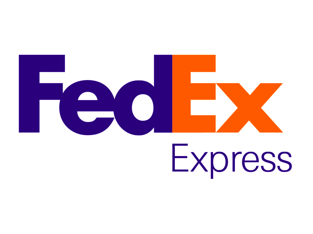
Arrow FedEx, Amazon smile or a client's handshake and manufacturer on the Hyundai logo, became known only after the company itself became known. No one can say for sure whether the idea nested in the logo helped them.
The presence of a hidden meaning can be a pleasant addition, but do not need to evaluate the logo on the presence of deep images. Moreover, in pursuit of an expression of some deep idea, you can lose the benefit that a simple sign brings.
The hidden meaning does not interfere if using it organically. It looks cool, but this is definitely not a mandatory rule.
Of course, if your logo is a copy of a competitor, it is bad. Customers will be confused.
But hit in originality for the sake of originality - no better. You may have such an original logo that you will simply do not understand. The client will turn to your, more calm, competitors. In addition, the field of activity always dictates certain standards that work as identifying "their own strangers". Take a look at the logo coffee or car companies. There, recognized as an absolute evil, the presence of common elements and similar logos, rather, the rule.
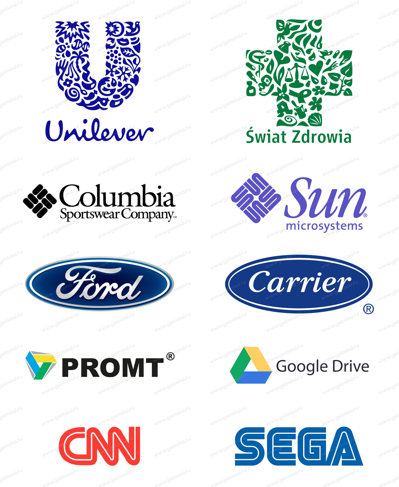
The search for "plagiarism" is really interesting, but on the efficiency of the Logos Puma and Jaguar, CNN and Sega, Promt and Google Drive, Land Rover and Ford, Gucci and Chanel - this does not affect. You will never confuse these companies. The fact that the purpose of the designer to make every logo is absolutely unlike others - this is a stereotype. The letter "A" is similar to the letter "A" - and nothing can be done about it. The same applies to all graphic solutions, most logos differ from each other only in detail.
Similar logos can upset, but it is not bad, this is the only possible position of things. In the modern world, thousands of new logos appear every day, and all sorts of graphic techniques have already been tested.
This does not mean that you need to take and copy other people's ideas. It is only calmer about the fact that you will no longer do something fundamentally new. Rather, something is wrong with the logo, if among millions of his colleagues you did not find any, even remotely similar to the "original".
Myth Fifth: Logo is very important
Of course, the logo is important, but its significance is often overestimated. The logo does not hypnotize customers, it does not matter how cool the agency did it and how many of your colleagues said: "Cool Logo!". Remember, the logo is significant for the success of the company about as well as beautiful facial features for success at work. The logo should not like everyone in a row and does not need an infinite number of discussions and alterations.For example, the last rebranding of the company Pepsi failed to taste far away, the logo allegedly became flat and lost the past flavor. On the Internet, the company was accused of senseless waste of funds, treated ideals and other mortal sins, little related to reality. As a result, Pepsi's drink was banned in forty-seven countries around the world, the company was broken, and the most important designer was shot! .. And if you don't believe it, then you are right. Because in fact, nothing like that did not happen.
Style is more important than the logo. A professional designer takes into account where the logo will be placed, selecting branded fonts and colors, creates a presentation in which it shows how the form of employees, product packaging, sign, website and everything that the customer wishes.
One picture from the logo, no matter how beautiful it is, will not bring the result. The sign will be successful if it is properly used. It should be placed on signs, the form of employees, products and other carriers, decorated in accordance with the company's branded style. In case of success - the logo is an excellent way to settle in the minds and make your symbol with the name of the nominal one. Millions buy Chinese T-shirts in online stores simply because they depict the green crocodile Lacoste or "Lzhukh" from Nike.
Output
All myths about design are not based on scratch. Nevertheless, strict rules are more meant than there really exist. We disassemble the most common stereotypes associated with the role of the logo, with what should be depicted on it, talked about the plagiarism and the value of the corporate identity. Do not fight with windmills, let them show you the direction of the wind.We also made a video version of this article, you can see here.